Thursday, January 31, 2019

Lab 7: Discerning Indian Burial Mounds using LiDAR data.

Introduction: On November 10, 2018, the University of Wisconsin-Eau Claire Geospatial Field Methods class ventured out to a field survey site on the lower Chippewa River (figure 1) to watch a drone survey of Indian burial mounds. The drone’s obtained picture data up to two centimeters of resolution, which can be used to discern where Indian burial mounds are. With the drone data, our plan was to process the data through Pix4D to create a 3D representation of our study area. However, the data was too large for UWEC computers to process. Because the drone data was too large to process, we were unable to create a 3D representation of our study area. Despite our misfortune, we were able to discern Indian burial mounds using LiDAR other methods in ArcMap, which is the focus of this lab.

Problem/Statement: To understand the best mean neighborhood value to use in determining Indian burial mounds using ArcMap.

Data Collection: In collecting data, we used Eau Claire County LiDAR data to generate a DEM of our study area.

Data Processing: Despite the fact we couldn’t create a 3D model using Pix4D, we were able to generate a Digital Elevation Model (DEM) of our study area using Pix4D. Once we created a DEM, we imported the DEM into ArcMap, and used model builder to filter out low and high points (figure 2). Using the raster clip function, we clipped the DEM to our study area, then used the focal statistics function to calculate the mean DEM for the raster. We calculated the mean DEM four separate times, one for 5, 10, 20, and 30 meter mean neighborhood values. After, we used the map algebra tool to subtract the focal statistics DEM from the clipped DEM, which gave us our final output. 

Figure 1. Study Area Map. 

Figure 2. Example of Model Builder. This was the general flow model of this lab, highlighted in the data processing section of the report. 

Results: In processing the data, I produced figure 3, figure 4, figure 5, and figure 6. Figure 3 represents 5-meter neighborhood value; figure 4 represents 10-meter neighborhood value; figure 5 represents 20-meter neighborhood value, and figure 6 represents a 30-meter neighborhood value. 


Figure 3. 5-meter neighborhood value.  
Figure 4. 10-meter neighborhood value. 


Figure 5. 20-meter neighborhood value. 

Figure 6. 30-meter neighborhood value. 
Discussion: In comparing figures 3-6, it seems that the 30- and 20-meter resolution produce the best representation of the Indian burial mounds. The Indian burial mounds are the dots above the plaid looking landscape in the center part of the map (figure 7). In comparing all the neighborhood values, it seems both the 5-meter and 10-meter shows too many high and low values. Both the 20-meter resolution and the 30-meter resolutions accurately show the location of the burial mounds without showing too many unnecessary values.  

Figure 7. Example of where the Indian burial mounds are located, represented by the red circle. 


Lab 6: ESRI Arc Collector


Purpose: The purpose of this lab is to gain experience using ESRI Arc Collector on our phones, while gaining experience with geodatabase set up.

Data Collection: Using ESRI Arc Collector and our cellphones, we walked out onto the UWEC campus to collect data points. We collected data points on trash cans, light poles, parking signs, traffic signs, and university signs. While collecting data points, we noted if they needed to be improved or not. Before we went out onto campus, we set up domains for each feature to note their feature type, owner, condition, and if they needed to be replaced (the result of our domains is seen in figure 1).


Figure 1. The result of the domains we defined. This example was for a light post. 

Data Processing: Once we collected all our data points using our phone, they were automatically exported to the class lab 8 folder in ArcGIS Online and displayed as a point.

Results: The results yielded the map in figure 2.  All the points are points we all collected, with each point either a light post, trash can, parking sign, traffic sign, or university sign. With each point we collected, we also noted the owner, condition, and if they feature needed to be replaced.

Figure 2. Map of the data we collected. The green dots are light posts, the black squares are parking signs, the blue triangles are traffic control signs, the red pentagons are trash bins, and the orange crosses are university/general signs. 

Discussion: Using ESRI ArcCollector was easy to use in my opinion. Once the domains are set it, it is easy to walk to data points, and note the characteristics about them. In my opinion, it is an effective surveying option because it of its accessibility. I could see myself using ArcCollector out in the field if I was collecting data like tree surveys, or the number of light poles to determine if an area has enough lighting.


Regarding the map at figure 2, in looking at the attribute table it seems that most of the points taken were light posts. There were 147 light posts out of 282 point features total. There were also 41 parking signs, 16 traffic signs, 22 trash bins, and 56 university signs. In analyzing the attribute table, it seems most of the features are in fair to excellent condition, only 32 features were stated to need replacing. The main indications with this map are they is lots of lighting on campus (at least on lower campus) given the number of light posts, however not a lot of trash bins.

It seems there isn’t a spatial pattern for light posts, other than being anywhere where there is a street or a walk path. University signs and trash bins seem to be closer to buildings, which makes sense given the signs are usually identifying the building they’re in front of, and trash bins are for the people who are entering and exiting the buildings. Parking signs are generally in parking lots, and traffic signs are generally by roads, which makes sense given the nature of those signs. 


Lab 5: Topographic Survey and Processing Drone Imagery


Problem/Statement: For this lab, the process of generating a TIN using topographic survey points and using drone imagery to create a 3-D map of the Aletsch Glacier will be addressed. The topographic survey and the 3-D map do not correlate with one another.

Part 1: Generating a TIN

Data Collection: In collecting the data to generate a tin, we took a topographic survey of Eau Claire’s Owen Park using a GPS. Because we used a GPS to obtain data points, we only took data points in the open areas of Owen Park. Places with high tree canopy often interfere with the accuracy of GPS because of satellite interference.


Data Processing: Once we took all our data points at Owen Park, we imported the points into a flash drive, then imported them into an Excel sheet. Once the points were imported into an Excel sheet, we imported the excel sheet into ArcMap. The excel sheet included attributes like the X, Y, and Z coordinates of the data points, so once the data was imported into ArcMap the function Display XY Data was used (figure 1). We used the NAD 1983 HARN Wisconsin CRS Eau Claire County coordinate system to project the points (in feet). Once the points were projected on the map, we used the Create TIN tool based on the points, which yielded the map in figure 2.   


Figure 1. The function "display XY data." 

Results: The results yielded a map in figure 2. As seen by the map, we didn’t capture points for the whole park, just the open spaces. The points for the most part captured the elevations, however their representation as a TIN might make Owen Park seem more mountainous then it is. Triangulation often makes points seem steeper than they are, which is the case with Owen Park’s representation. Despite the inaccurate representation of the park’s more gradual elevation changes, the TIN seems to represent the overall character of the X-Y-Z data points and the park’s elevation, just not the changes in elevation.

Figure 2: TIN of the survey. 

Part 2: Creating a 3-D Map of the Aletsch Glacier

Introduction: Drone imagery can be important for creating 3-D images of hard to access places, like the Aletsch Glacier. In this part of the lab, we used drone imagery to create a 3-D image of the Aletsch Glacier, then calculated the volume of the glacier.

Data Collection: For collecting the data, we downloaded RGB drone images from http://www.sensefly.com/education/datasets under the Aletsch Glacier tab.


Data Processing: Once downloaded, we imported the images into Pix4D to create a 3D map. All the X-Y-Z coordinates were included with the pictures, so importing the coordinates were not necessary. Once the data was imported into Pix4D, we created a 3-D map. 

Results: After 5 ½ hours of processing, the results yielded figure 3, a 3-D map of the Aletsch Glacier. 
Figure 3. Results of the Pix4D processing
Using the calculate volume tool in Pix4D, we digitized the approximate area of the glacier to calculate the volume (figure 4). In calculating the volume, the results yielded a terrain area of 337,555.41 m^2, and a total volume of 1,705,429.06 +- 37821.30 m^3.

Figure 4. Calculating the volume of the glacier. The green lines represent the digitizing of the glacier. 

Discussion: This is the second lab we’ve used Pix4D, and I’m seeing its wide array of applications. In the first lab, we created a historical mosaic of the Eau Claire area, and for this lab we created a 3D model of a glacier using drone imagery.


Lab 4: Georectifying Historic Imagery using Pix4D and ArcMap


Purpose: In this lab, the process of georectifying historic imagery will be addressed, using Pix4D and ArcMap. The purpose is to gain experience with Pix4D, to understand the importance of Ground Control Points, and to create a dataset of historical imagery.

Data Collection: For the lab, historical imagery data from 1939 was 
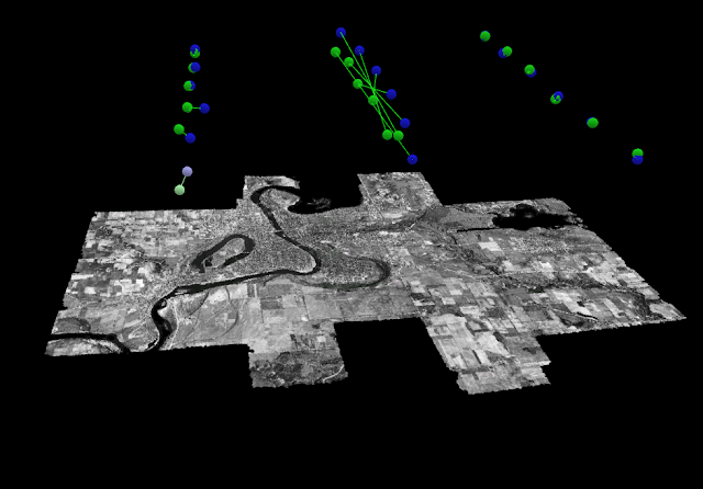
downloaded from the Wisconsin database for historical imagery (figure 1) (https://maps.sco.wisc.edu/WHAIFinder/#12/44.7885/-91.5292). Each white dot represents a different historical image, attached with the name of the image and it’s roll number.


Figure 1. The example of where to find data for this lab. Each white dot represents a different image. 


The white dot also represents the geographic center of each image, which we used to map the approximate location of where the image was located. To do that, we digitized the dots in ArcMap and created a separate shapefile, where we also calculated latitude, longitude, altitude, and provided the image name in the attribute table. Once the attribute table was created, we exported the table as a dBASE table, then converted it into an XLS file. Once we converted it into an XLS file, we got ride of certain fields within the attribute table (i.e. every field except latitude, longitude, and elevation), then converted the file into a CSV file.

Data Processing: Once the CSV file was created, we started importing the data into Pix4D. We first imported the file containing the historical imagery, and then assigned the CSV file to the historical imagery. Once the CSV file was assigned to the historical imagery, we created a 3D model that yielded certain rectifications like a Mosaic, or a Digital Surface Model (DSM).


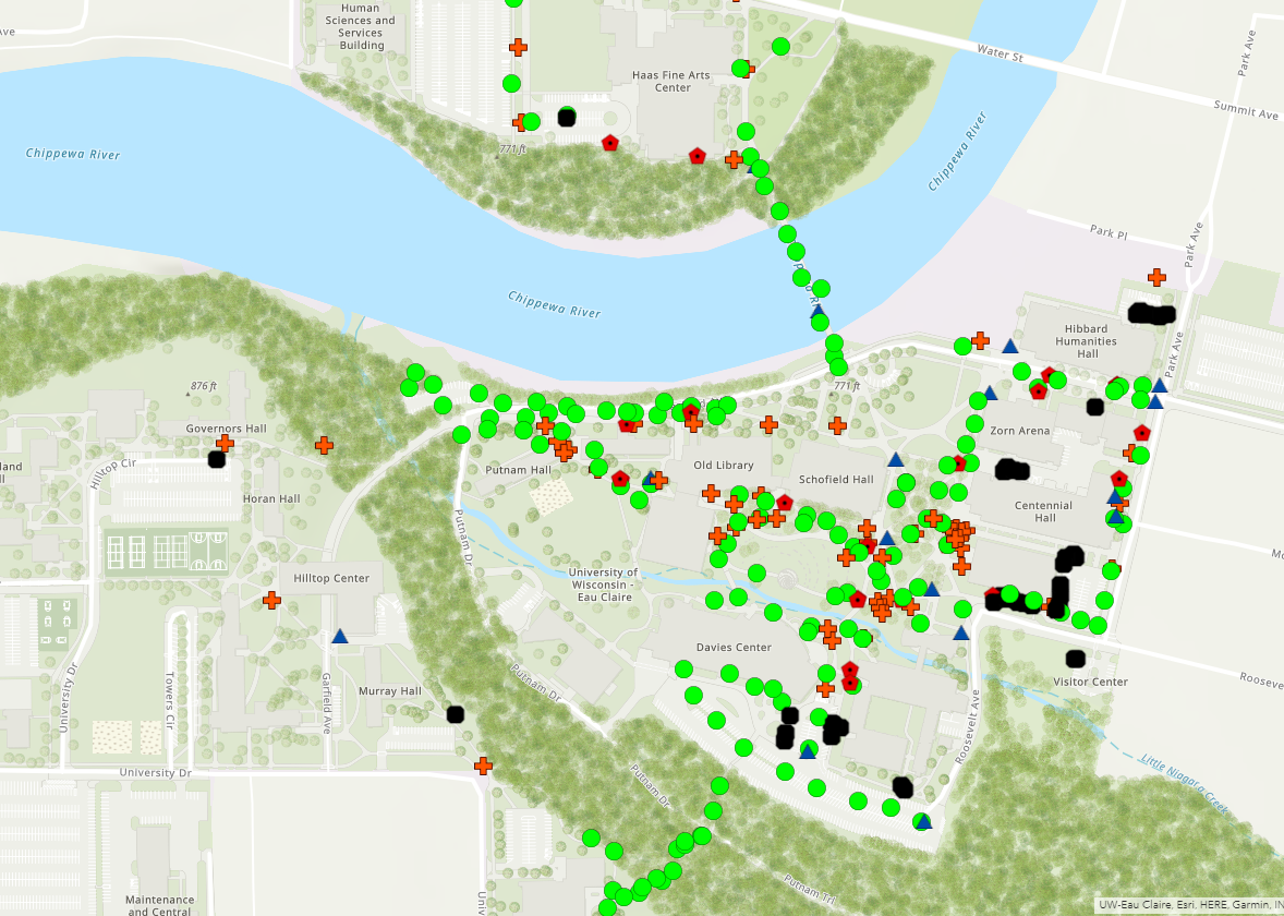
Results: The results in Pix4D yielded figure 2. The map is of the of the city limits of Eau Claire, WI, and it seemed to rectify well (i.e. there wasn’t any trouble placing the right image to the accurate geographical location). In comparing the mosaic to a basemap of Eau Claire in present day (figure 3), it seems mostly accurate. The roads on the eastern portion of the map don’t match up entirely, and the river on the northern//south western portion of the map are a little off compared where the river is flowed. However, for manually digitizing the white points and not using precise location, the images seem to be in their approximate location. 


Figure 2. The Pix4D result of rectifying the historical imagery. 

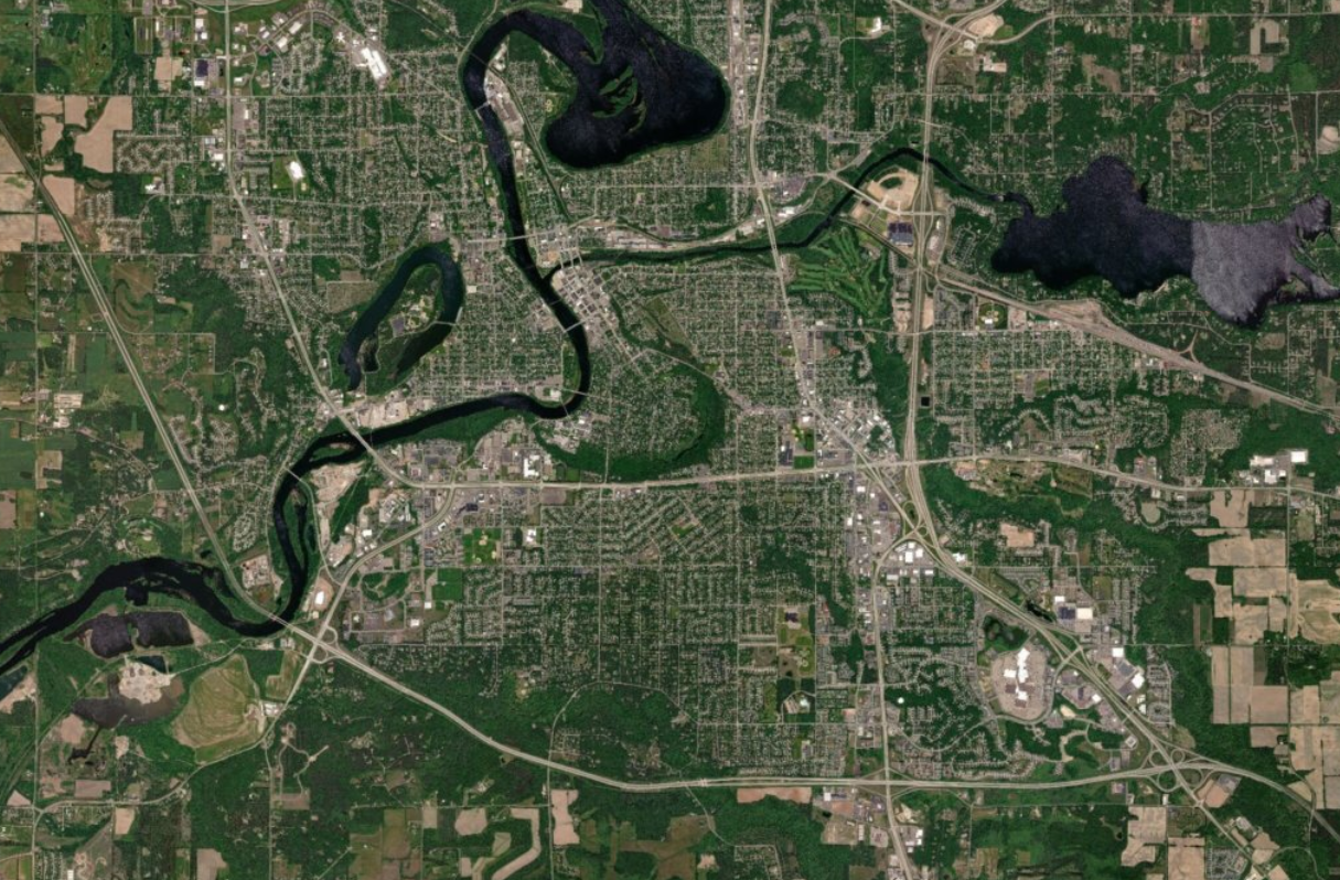
In comparing 1939 Eau Claire to present-day Eau Claire, it seems like urban sprawl moved south after 1939. In looking at figure 3, it seems like most of the southern portion of the photograph is farmland; however, in looking at the present-day photograph of Eau Claire (figure 4), that whole area became residential neighborhoods. One can also see the emergence of major roads after 1939, with the interstate spanning the southern portion of figure 4, and Clairemont spanning the center portion of the photograph. Certain features stayed the same, like most bridges crossing the river, or most of the neighborhoods in the center of the photograph.

In comparing the river, it’s hard to tell if there have been major changes because the mosaic is skewed west compared the present-day map. The islands in Dell Pond (north part of the photograph) seem similar, and Lake Altoona (eastern part of the photograph) seems relatively the same. 


Figure 3. The historical image of Eau Claire over the current landscape. 
Figure 4. Present day aerial image of Eau Claire. 

Discussion: In creating the mosaic of the historical imagery, I didn’t have any trouble in doing the assignment. I thought my files rendered well and produced a relatively accurate image (that with a little georeferencing, could be even more accurate), and I found the process smooth and painless.

This lab is important because we produced a valuable dataset with mosaicking historical imagery. Historical imagery could be used to map urban sprawl, or to see how certain water features have changed over time. 


Lab 3: Topographic Survey


Introduction: Topographic surveys are important to the field of surveying. Topographic surveyors create X-Y-Z coordinate data (X being latitude, Y being longitude, and Z being the elevation), which planners use for various reasons (i.e. data maintenance, establishing property boundaries, etc.).

Problem/Statement: In this lab, the process of collecting survey point to create a topographic survey of the University of Wisconsin-Eau Claire (UWEC) campus, and a 3D landscape model will be addressed.

Data Collection: For this lab, we used a total station (Figure 1) to collect the data points. Total stations help obtain X-Y-Z coordinate data, which give surveyors accurate data points to process. Surveyors walk around with a prism (Figure 2), and the total station shoots out a beam to the prism, and the prism bounces the beam back, which indicates distance (Bergervoet, Powerpoint, 2018). In calculating distance, the data collector also calculates the XY coordinates using the horizontal angle on the reading. The data collector also calculates the Z coordinate using the vertical angle, height of the rod, and height of the station (Bergervoet, Powerpoint 2018).


Figure 1. An example of a total station. Taken from https://en.wikipedia.org/wiki/Total_station


Figure 2. An example of a prism. The prisms are usually attached to a long rod, with th eprism on top. Taken from http://www.galasurvey.com/DDDDDDD/html/?218.html

Data Processing: Once the data was collected, they were put into a text sheet with X, Y, Z, and description being the headings. The text sheet was imported into ArcMap, where the “add XY coordinates” function was used (Figure 3). Once the XY coordinates function was used, it created a point feature class where we took the data points. The data points were then exported into a shapefile, then the “Create TIN” function was used to create a 3D landscape model of our topographic survey (Figure 4). The “Edit TIN” function would have been used, however the landscape model seemed accurate enough for this exercise. Also, the TIN was then converted into a raster for the purpose of creating contour lines (Figure 5). 

Figure 3. The display XY data tool. 

Figure 4. The create TIN tool. 

Figure 5. The create contour tool. 

Results: The results are represented in Figure 6. The topographic survey was relatively accurate, given the amount of points we obtained. The flow of the river isn’t the most accurate; the river on the TIN is wider and more triangulated than the basemap, however the survey got the general flow of the stream. Overall, the TIN got the general idea of the campus mall X-Y-Z representation, however with more data points it could have been more accurate.  


Figure 6. The topographic model, represented as a TIN


Lab 2: Distance-Azimuth Surveys.


Introduction: Technology like rangefinders and total stations are used for surveying purposes. Total stations measure and collect the horizontal distance and azimuth data from one basepoint to another, with the goal of producing a distance-azimuth survey.

Problem/Statement: In this lab, the process of obtaining horizontal distance lines using a rangefinder will be addressed.

Data Collection: For this lab, a Trupluse rangerfinder (Figure 1) was used to collect horizontal distances and azimuths. Using three control points on the University of Wisconsin-Eau Claire campus, horizontal distance and azimuth was collected manually from various features (i.e. lightposts, trees).


Figure 1. The TruPulse Rangefinder

Data Processing: Coordinates on the control points were given to us already in an excel sheet, however we needed to add the data to ArcMap. Using Add XY Data, the excel sheet containing the control points were converted into points, then exported into a shapefile.

Once the horizontal distance and azimuth data was collected, they were entered excel sheets based upon the control point. Once the horizontal distance and azimuth data were entered, data on the XY coordinates were entered each control point’s spread sheet (spreadsheets found in Figure 2). Once the excel data was entered and imported into ArcMap, the Bearing Distance to Line tool was used to convert the excel sheet into line data. Once the line data was created, the Feature Vertices
to Points tool was used to add points at the end of the line data. 


Figure 2. An example of the tabulat data imported into excel. Each control point has its own excel table. 

Results: The data collection and processing yielded the results in Figure 3. In analyzing the accuracy of the lines, they didn’t seem that accurate. For example: the line farthest west at control point 103 was supposed to measure a duck in the stream, however the endpoint seems to be a tad south of the stream. Another line in point 103 yielded inaccurate results, the line moving southeast was supposed to point to a sign on campus north of the Davies Center, however it ends on the Davies Center. 
Figure 3. Distance-Azimuth survey of the UWEC campus. 

 Also, upon further analysis, the data for control points 101 and 102 were entered wrong, so the data for point 101 should be for point 102, and vise-versa. To fix that, one would enter the right coordinates into the appropriate excel sheet, then enter it into an excel sheet.